
Update 2022, the alphavantage API is now paid, so the app can’t get stock data anymore :(
Scatter Stocks was inspired by a Bloomberg article on how companies kept getting “Amazoned”. To be Amazoned means to have your business crushed because Amazon got into your industry.
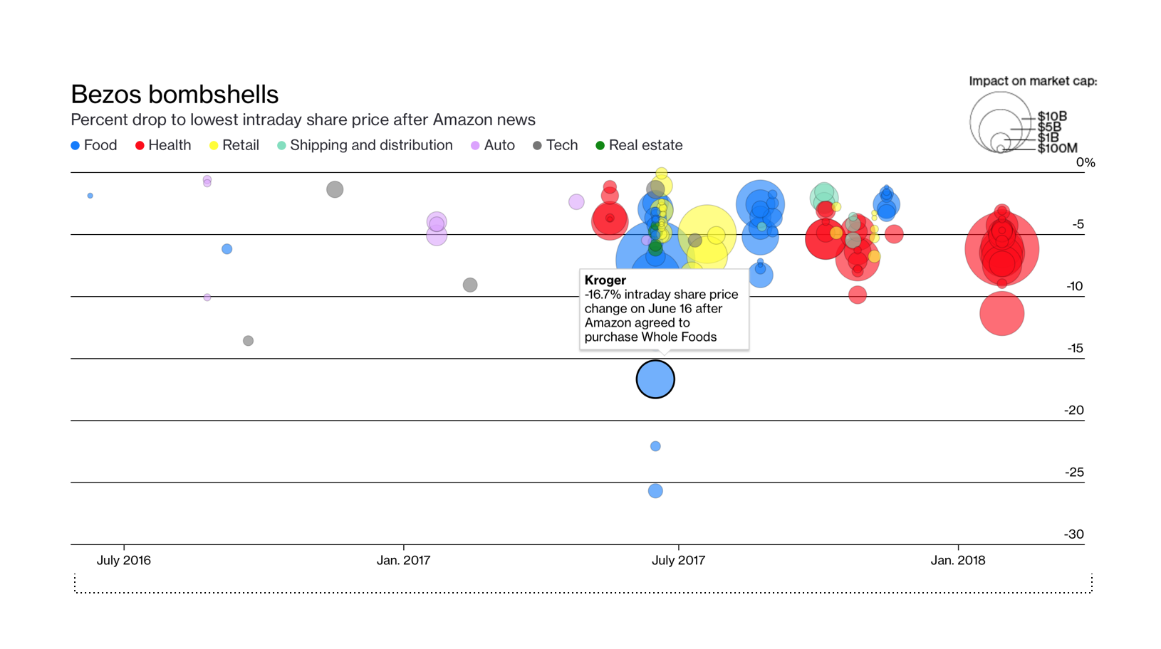
Embedded within their article was a graph called Bezos Bombshells. It was a great visualization that displayed how different shares rose and fell based on news from Amazon. For example, when Amazon accquired Whole Foods, stocks of Walmart and Kroger dipped.
The graph was a great visual aid to understand why stocks may rise or fall. However, I wasn’t satisfied with a graph just about Amazon. I wanted to see similar graphs for many different companies to see the impact of news on share prices.
I was determined to see how I could recreate a so called “Bombshell” graph for any company based on a series of events. If you run the example on the homepage, you can see how stocks of Apple and it’s competition changed as per news events.
Checkout the final website.
You can follow the HN Discussion as well.