
Something I’ve learned from working on a startup is that there are too many options. There’s no management to tell you which way you should be going.
Traditionally, I’ve always used a product prioritization matrix to help pick the next things to work on.
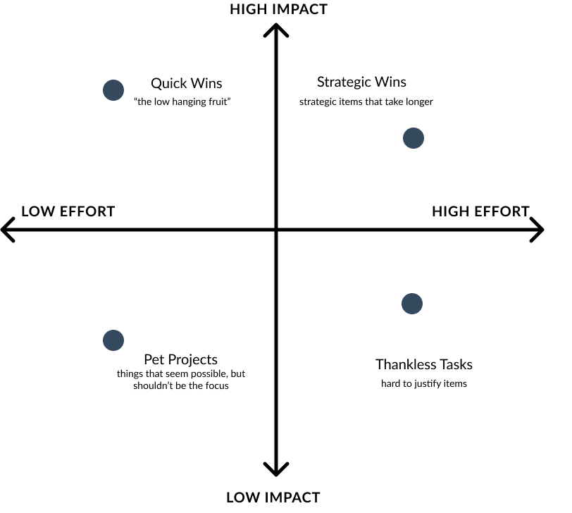
impact and effort matrix
When I was working with the Co.Lab founders, we often had disagreements over which features we wanted to build next. It was too easy to get excited with what I wanted to build next and forget what customers actually wanted. This made conversations more icky than they should have been.
It would have been great if there was a way to take opinions out of the equation and make more objective prioritization decisions.
Prioritizing without decisions
If you think about it, everything on the prioritization matrix is an x,y coordinate.
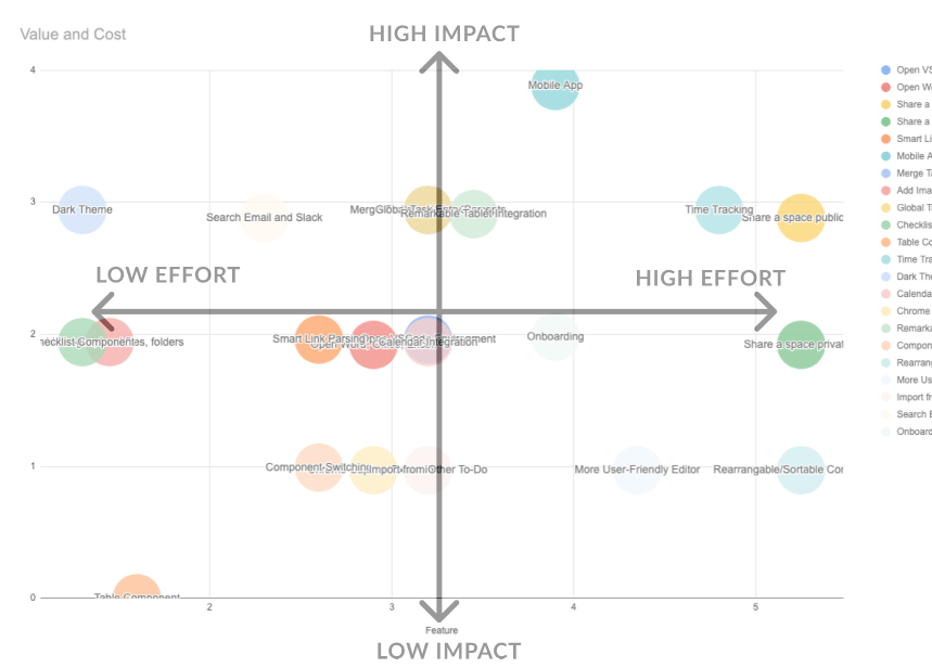
quantitatively graphing my features
Those X,Y coordinates are effort and cost respectively. So for any bubble on the chart, if I could figure out a numerical formula for the effort and cost, we could make a prioritization matrix.
How it works
We need to calculate or come up with scoring for two things: Impact and Effort.
Calculating Impact
The first step was picking the criteria that defined impact for our team. Here were a few questions that I used to judge our features:
- Expected - Did our customers expect this feature from us? (e.g. competitors)
- Wow Factor - Does building this make our users go wow?
- Need by Others - Is this a dependency for other items?
The trick is to make the answers boil down to a number. In my case, a series of 1’s and 0’s that represent yes and no answers. I found it easier to get alignment on Yes/No criteria than it is to pick a number between 1-10. This makes judging features to have less of a debate. To create more distinction between features, add more criteria.
| Feature | Expected | Wow | Need by Others | Impact |
|---|---|---|---|---|
| add checklist tab | 1 | 0 | 1 | 2 |
| add sharing links | 0 | 0 | 1 | 1 |
| time tracking | 1 | 1 | 1 | 3 |
Impact is the SUM of all the columns. This usually results in some whole number. Not all criteria have to be equal either. For example, if your team values the Wow factor a lot, you could add multipliers to that column to have those features weigh higher.
The more granular you make the criteria, the more varied your impact scores will be. You’ll also be able to articulate to your team why one feature is more meaningful than another.
Adding Dev Effort
The last piece for our matrix is the effort, or cost coordinate. I used simple t-shirt sizing (1-3) for this. Depending on how big an item is, I’d assign it a cost between small to large.
| Feature | Impact | Estimated Cost |
|---|---|---|
| add checklist | 3 | 2 |
| share space | 1 | 1 |
| time tracking | 4 | 3 |
Now that we have values for both of our axes and each feature, we can plot our cost vs impact score as a scatter chart.
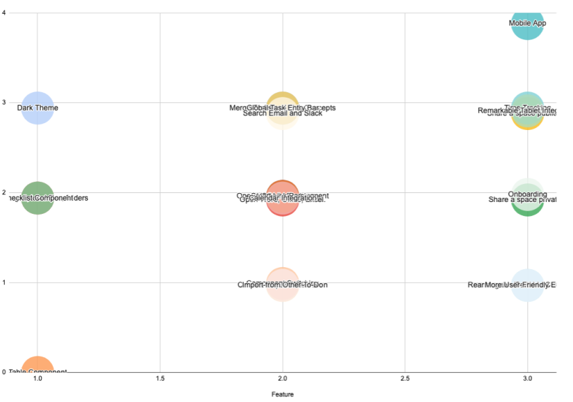
You may realize that things don’t look quite perfect yet. The bubbles begin to overlap each other. This is because we used whole numbers and integers without enough variation between them. There’s too much overlap in the costs among items.
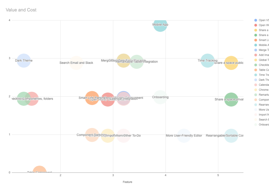
To overcome this, I multiplied my effort column with a randomize function. A good random factor helps us consider the completion of items ahead of schedule and behind schedule.
=D2*(1+RANDBETWEEN(1,5)*0.15)
I also apply a similar variance to the impact column to shuffle the items around a bit more. This adds more variance.
Final Decisions
Finally, plotting and randomizing some of the values allowed me to have a spreadsheet scatter plot.
and the final feature table looked like this:
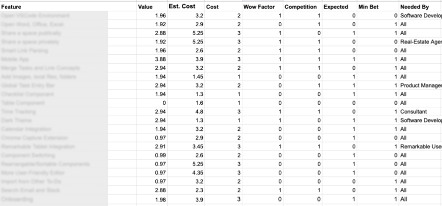
The spreadsheet ended up becoming super helpful for the team. When deciding to pick the next items for the sprint, I could sort the items with the highest impact and work backwards. It removed debate and everyone was a lot more aligned on the next feature to build.